Posts tagged Department Data
(EDIT: images updated with 2174 data.)
Here’s a picture of (lecture, non-supervisory) sections taught by CSSE faculty since Fall 2008:

Because the number of sections taught has gone up rather dramatically, here’s the same data, normalized by sections per year, to show the fraction of classes taught in each category:

There are many caveats and things to explain about these pictures.
Following Zoe’s excellent suggestion, I added color to the course dependency chart:

The arrows should be the same as the previous chart, though you’ll notice that because of the way I generated it, the chart now includes the classes that don’t have any edges connected to them.
The colors relate to the number of students that have enrolled in each class. Specifically, the log of the number of students that have taken the class from fall 2010 through spring 2016. Classes with zero enrollment are given log(0.5). The class with the highest value is red, the one with the lowest value is green. Yes, there should be a legend. Classes that aren’t in the Computer Science catalog are gray.
Note that I have no idea how many of these enrolls are repeats. That would be interesting, but I’ll need a different data source to answer that question.
The numbers for each class are interesting, and I think I’ll just publish them separately.
(EDIT: updated with 2174 data.)
Another picture!

This picture shows the evolution of class sizes in classes taught by Computer Science faculty since Fall 2008. Specifically, it shows the likelihood that a randomly chosen scu will belong to a class of a given size.
So, for instance, you can see that in Fall 2008, more than 50% of our SCUs were delivered in classes of size less than 30, and that in Winter 2017 (2172), about 90% of our SCUs were delivered in classes of size 40 or less.
Here’s the picture for the College as a whole:

You may be wondering why I keep yammering on about SCUs, rather than saying things like “50% of classes…”.
Here’s another interesting picture. (Well, I thought it was interesting, anyway.) It shows the number of WTUs taught by the CS department faculty, from Fall 2008 up through Spring 2016. It includes courses with a bunch of different prefixes: CSC, CPE, HNRS, EE, ENGR, LAES, ME, and DATA.

This graph is broken up by the level of the course. The lowest (white) region shows courses whose names start with “01” (like “0123” and “0101”), the second region shows courses whose names start with “02”, and so forth. The “Sup” region shows the supervisory courses; senior project, master’s thesis, etc.
One note on “adjusted WTUs”: this data is taken from the FAD report, which misclassifies senior projects as lab courses, resulting in some very broken data. I’ve corrected this by re-assigning WTUs according to the CSU’s formulae.
Also, these are all classes taught by faculty associated with the department, so it includes lots of courses taught to nonmajors, as well as some courses taught by department faculty with other prefixes (for instance, a Mechanical Engineering course).
To me, the most interesting thing about this picture is frankly how flat it is. Our enrollments have gone way up, but the number of WTUs we’re teaching is pretty much unchanged.
I think the next picture to draw is how class sizes have changed over the years.
All parsing and rendering done in Racket. Isn’t it time that you learned Racket for yourself? :).
Here’s an SVG showing all of the dependencies associated with CSC courses:

Yes, it’s a little small to read. Click on it to see a bigger version. It’s an SVG, so you can blow it up arbitrarily. (Note: this picture is a lot more readable since Aaron Keen made the eminently sensible suggestion that it be left-to-right rather than bottom-to-top.)
Things to know about this data:
- It’s scraped from the 2015–2017 course catalog in HTML format.
- All cross-listed courses are normalized to their CSC equivalents.
- Arrows are shown to all courses mentioned in the prereqs.
The last of these is significant. If a course has a pre-requisite like “Both CSC 124 and one of MATH 117 or MATH 118”, I just draw arrows to all of them. So don’t assume that the number of outgoing arrows is an indication of the number of courses required to take this course.
- There are lots of courses shown here that haven’t been taught in a long time. CSC 108 jumps out at me, but there are others.
- Some courses have a prerequisite that can be fulfilled by a no-longer-existing course. For instance, CSC 141 changed into 348, but there are still a bunch of courses that list CSC 141. Since 141 is not displayed as a hyperlink in the catalog, we assume that it’s defunct, and we don’t show it.
- No dependencies are shown for non-CSC courses.
All scraping and processing done in Racket, natch. Graph drawn with Dot.
Okay, here’s a nice picture:
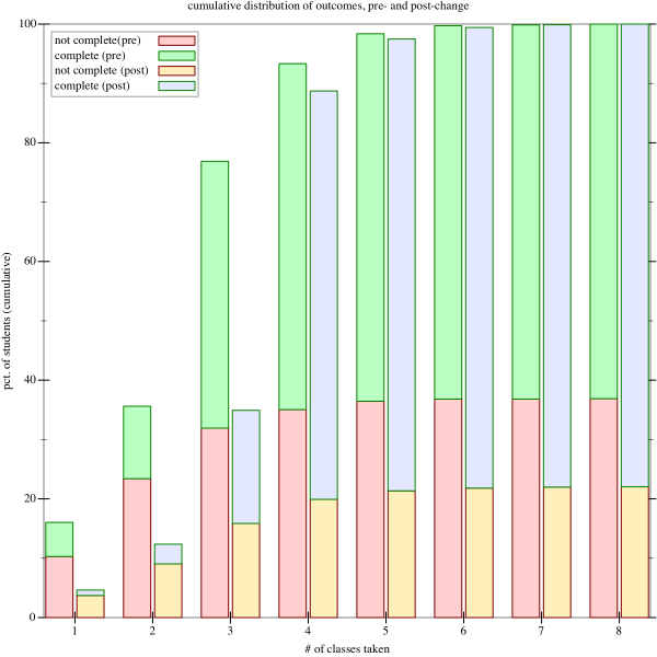
This compares the outcomes in the years 2005 through 2009, before we instituted 123, with the outcomes in the years since. This is a cumulative graph, showing for a number of classes how many students finished by taking that many classes or fewer, and whether they succeeded or failed. Success is defined as having gotten a grade of C- or better in 103 (that is, the condition that allows them to continue with higher-level classes in the major).
So, for instance, we see that in the years before 123 was added, more than 90% of students took four classes or fewer, and that about 38% of those students did not successfully finish. In the years after 123 was added, slightly less than 90% of students took four classes or fewer, and of those, only about 23% left without finishing.
The big picture here is the post-change years have a much lower dropout rate; our first-year retention has improved from 63% to 77%, a dramatic increase.
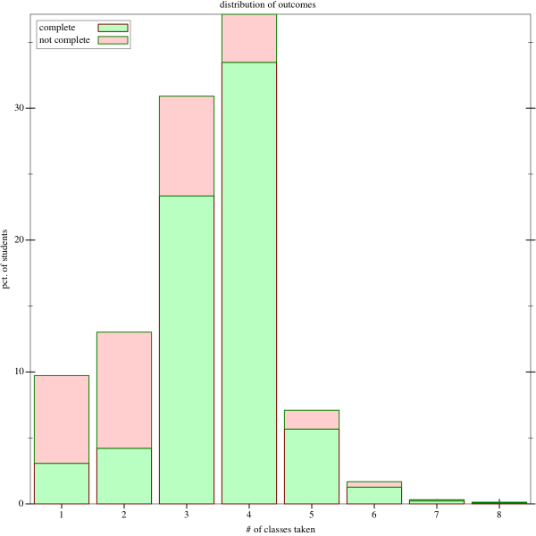
Here’s a pair of pictures showing the distribution of # of classes taken in the first-year curriculum. There are only four classes, so this is really a picture of students repeating classes, and how many times they repeat them. So, for instance, we see that about 8% of students take exactly five courses (most likely repeating one), and that in this group, approximately 85% are then finished successfully.
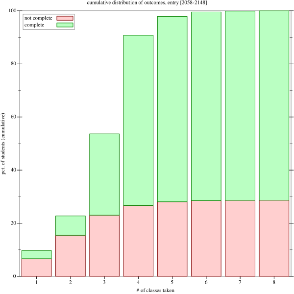
This graph shows the cumulative distribution; it’s just the discrete integral of the prior picture.
Note that a lot of people come in with AP credit, and skip one or more classes, which is why we see a lot of people finished after one or two classes.
It’s also interesting how many people stop after one or two classes. You can look at that either as bad news or good, depending on whether you see these students as promising ones that we squandered, or students that quickly discovered that computer science was not for them.
Also note that since these pictures span 2005 to 2015, they cover the period from 2005–2010 when the course sequence was only three courses long. The obvious next step is to split these graphs into two graphs, to see whether the addition of 123 to the curriculum had a major effect.
All analysis done in racket, naturally.
All analysis code (though not the source data) available as part of this github repo.
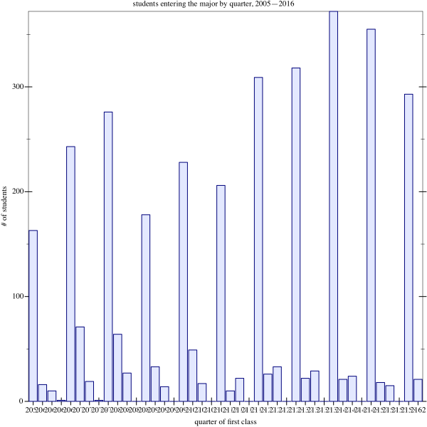
A quick picture of the number of students entering cal poly’s computing majors (CSC, CPE, SE) from 2005 through 2016:
First, a disclaimer: I can’t imagine this will be interesting to anyone not at Cal Poly. I’m using these blog posts as a way of dumping a bunch of interesting-to-me graphs and visualizations of the behavior of students in our first-year sequence here at Cal Poly.
First, an animation:
path of students through the first year
Using racket and OpenGL, I generated movies showing individual students (each one represented as a blue square) moving through our first-year sequence. This data is based on information about grades earned by students in our courses from Winter 2005 through Winter 2016.
The four columns represent the courses in our first-year sequence: CPE 123, CPE 101, CPE 102, and CPE 103. Note that CPE 123 was not offered before Fall 2010.
Time is represented as time in the animation. That is, the first thing you’ll see is a bunch of students entering the program in 2005. The vertical placement of the dot represents the grade they got in the course (with some noise added to prevent all students from landing on top of each other).
Notice that the reduced size (480p) makes the animation run smoother. You can full-screen it to see it better. There’s also a higher-resolution version that I made, but it looks to me like it doesn’t actually convey any more information.
Finally, I really should figure out how to slap text on the screen as part of an OpenGL animation, so that I can label the thing.